The cover was relatively straightforward. Early on I’d sent my publisher some ideas for the cover design, mainly screengrabs of book covers or film posters I thought might inspire the in-house design team. I did a very basic mock-up cover idea.

A key inspiration
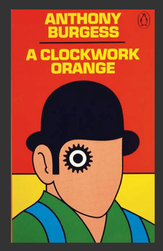
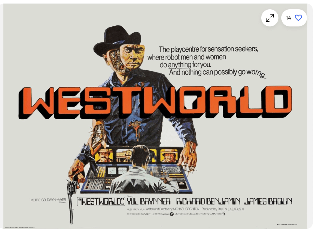
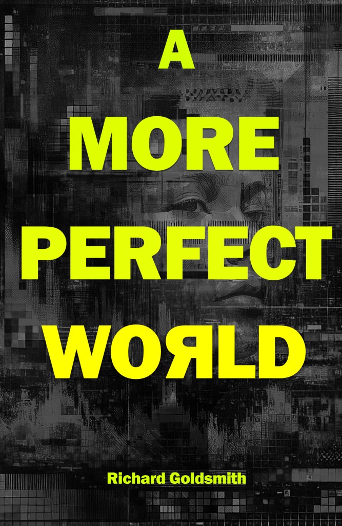
One idea that wouldn’t go away was the sense of one or more of the title words being scrambled. A key inspiration from my comic reading years was the poster for the original 1973 ‘Westworld’ film starring Yul Brynner. In the film lifelike androids at an amusement park begin to malfunction and attack the human visitors. The poster visually represented this by having Brynner’s face slipping away to reveal the circuitry of a robot but it was the film’s clever tagline that really lodged in my imagination: ‘Where nothing can possibly go worng…’. The last word was deliberately incorrectly spelt and visually sagged. It matched the film’s theme brilliantly.
Spec designs
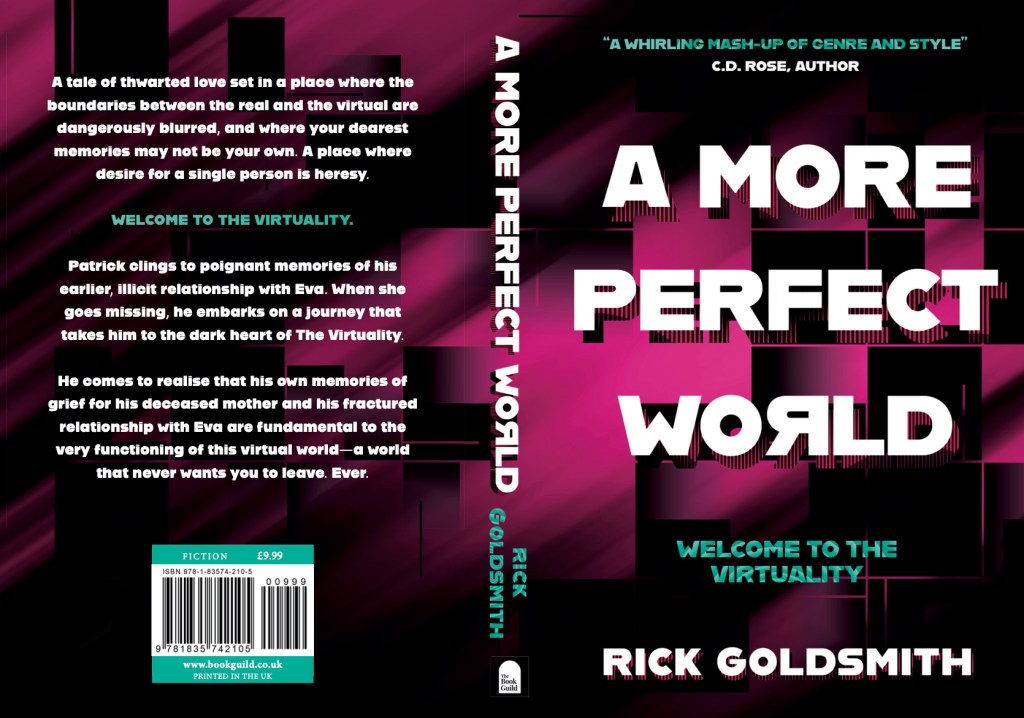
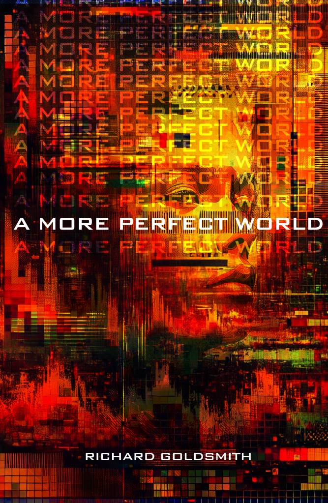
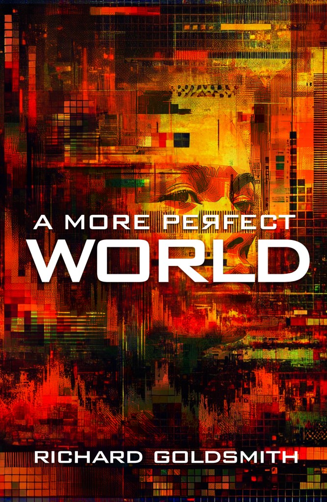
This led me to try inverting the ‘Rs’ in the title ‘A More Perfect World’ to give that same feeling of a glitch in coding, or a mistake being repeatedly looped. But visually it felt like too much. Instead a single inversion of the last ‘R’ in ‘World’ or ‘Perfect’ looked better and wasn’t too confusing. My friend, Innes Jones, a designer whose work I adore and who has done a lot of Catcher Media’s graphics over the years, said he’d make up some spec designs. I sent all of the above to The Book Guild and after some time they informed me that Innes’ designs weren’t suitable. It was to be a long wait before I saw the final cover.
A city full of sass and energy
The initial design didn’t arrive until we were in the third week of our time in Colombia, in a great city called Medellin. Medellin was like a Manchester to Bogota’s London, once the murder capital of the world, it had been transformed and was now full of sass and energy. I could understand why the design hadn’t been forthcoming until the final proofread had been finished but I was desperate to see it. When it finally arrived on my ‘phone Julia and I were in El Poblado, in a fancy place full of a trendy digital nomads hunched over their laptops eking out their coffees and swapping stories about the best bars in town.
I liked the design a lot
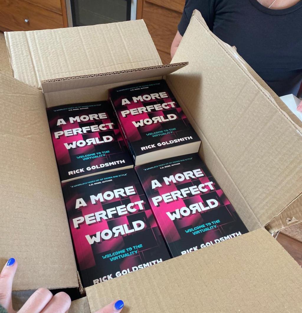
I opened up the design and my apprehensive heart didn’t sink. In fact I was surprised that I liked it. A lot. It definitely wasn’t what I was expecting but that was no bad thing. Julia said she thought it was good. Admittedly it needed some tweaks, things re-arranged or re-sized but the basic design was there. The publisher had retained the inverted ‘R’ in the last word and the font, the background and colour scheme all worked well. A few emails later it was just as I’d wanted it and, hey presto, my book had a front and back cover with a blurb and a spine. Result!


Leave a comment